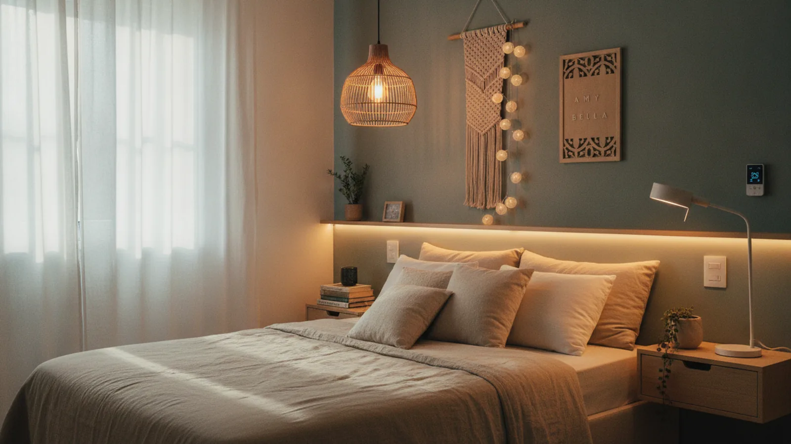
Dining Room Colour Ideas
A practical step-by-step guide to dining room colour ideas, including preparation, instructions, common issues, tips, and next steps.

Dining Room Color Ideas
Choosing the right color for your dining room can transform it from a simple eating area into the heart of your home. This guide provides a clear, step-by-step process for selecting a paint color that reflects your style, complements your home's features, and creates the perfect atmosphere for any occasion. Whether you're aiming for a formal, elegant space or a casual family hub, we'll walk you through assessing your room, understanding color theory, and testing your choices like a pro.
Fast Answer
- Key Decision: Start by defining the mood you want to create—cozy, formal, or lively.
- Key Action: Always test paint samples on a large board in your dining room.
- Main Reason: Colors change dramatically based on your room's unique natural and artificial light.
Before You Start
Proper preparation is the key to choosing a color you'll love for years. Gathering a few simple tools and making some initial observations will save you time and prevent costly mistakes. This process is about thoughtful planning, not just picking a pretty color from a chip.
What You Need
- Measuring tape: To calculate square footage for paint estimates later.
- Smartphone camera: To take photos of your space in different light.
- Notebook and pen: For jotting down observations and ideas.
- Color wheel: A physical one or a digital app to help you explore color relationships.
- Paint chips: Free samples from a local hardware or paint store.
- Paint sample pots: For your top 2-3 color choices.
- Small paintbrush or roller: To apply the sample paint.
- White poster board: For creating large, movable paint samples.
Safety, Timing, or Context Checks
Step-by-Step Instructions
Follow these steps in order to methodically narrow down your options and find the perfect color for your dining space.
Define the Mood and Function
Before you even look at colors, decide how you want your dining room to feel. Is this a formal room used only for holidays and special dinners? Is it a casual, everyday spot for family meals and homework? Or is it a multi-purpose space that needs to be flexible?
Your answer will guide your color direction. Warm colors like reds, oranges, and terracottas tend to be stimulating and sociable, which can be great for lively dinner parties. Cool colors like blues and greens create a more calm and relaxing atmosphere. Dark, saturated colors like navy, charcoal, or deep green can make a room feel intimate and dramatic, perfect for formal or evening dining. Lighter, airy colors make a space feel larger and more casual.
Assess Your Room's Fixed Elements
Look around at the items in the room that are difficult or expensive to change. These are your "fixed elements," and your new wall color must work with them. Make a list that includes:
- Flooring: Note the color and undertones of your wood, tile, or carpet. Is the wood a warm honey oak, a cool-toned gray, or a rich, red cherry?
- Furniture: What is the finish of your dining table, chairs, and buffet? A dark mahogany table has different needs than a light pine one.
- Window Treatments: If you're keeping your current curtains or blinds, their color and pattern are part of the equation.
- Trim and Woodwork: Is your trim a crisp white, a creamy off-white, or a natural wood stain? This will be the frame for your wall color.
- Visible Adjacent Rooms: Note the colors in connecting rooms, like your kitchen or living room, to ensure a smooth visual flow.
Identifying the undertones (the subtle hints of color within a neutral) of these items is crucial. A "beige" carpet might have pink, yellow, or green undertones that will clash with the wrong wall color.
Analyze the Natural and Artificial Light
Light is the single most important factor in how a paint color will look in your space. Spend a full day observing how the light changes in your dining room.
First, consider natural light. The direction your windows face has a huge impact:
- North-facing rooms get cool, indirect light. Colors can appear darker and more subdued. You may want to choose a warmer color to counteract this.
- South-facing rooms get intense, warm light all day. Most colors will look great, but very warm colors can become overwhelming.
- East-facing rooms get bright, clear light in the morning and become cooler in the afternoon.
- West-facing rooms are darker in the morning but get very warm, golden light in the late afternoon and evening.
Next, evaluate your artificial lighting. Turn on all the lights you typically use for dinner. Light bulbs have a color temperature measured in Kelvins (K). Bulbs labeled "warm white" (around 2700K) cast a yellowish glow that enhances warm colors. Bulbs labeled "cool white" or "daylight" (4000K-5000K) cast a bluer light that works well with cool colors.
Use a Color Wheel to Build a Palette
Now that you know your room's mood, fixed elements, and lighting, you can start building a color scheme. A color wheel is a powerful tool for this. A simple and effective guideline is the 60-30-10 rule. This interior design principle suggests a balanced palette:
- 60% Dominant Color: This will be your main wall color.
- 30% Secondary Color: This is often for furniture, an accent wall, or curtains.
- 10% Accent Color: These are the small pops of color found in artwork, pillows, or décor.
Consider these basic schemes:
- Monochromatic: Uses different shades and tints of a single color. It's a sophisticated, calming, and easy-to-create look.
- Analogous: Uses colors that are next to each other on the color wheel (e.g., blue and green). This creates a serene and harmonious feel.
- Complementary: Uses colors opposite each other on the wheel (e.g., blue and orange). This high-contrast scheme is energetic and bold. It works best when one color is dominant and the other is used as an accent.
Gather and Shortlist Color Samples
With a color family in mind, head to a paint store and collect physical paint chips. Do not rely on colors you see on a computer or phone screen, as they are never accurate. Grab a variety of shades within your chosen color family—some lighter, some darker, some warmer, and some cooler.
Take them home and tape your top 5-7 choices to the wall in your dining room. Leave them up for at least 24 hours. Look at them in the morning, afternoon, and evening with the lights on. This will help you quickly eliminate colors that don't work with your lighting. Some will immediately look too gray, too yellow, or just "off." Narrow your list down to your top two or three contenders.
Test Your Final Choices with Sample Pots
This is the most critical step. Purchase small sample pots of your final 2-3 colors. Do not skip this. Using a small roller or brush, apply two full coats of each sample color onto a separate piece of large white poster board (aim for at least 2 feet by 2 feet). Let them dry completely.
Now you have large, movable samples. For the next few days, move these boards around the room. Hold them up against different walls. Place one next to your window trim. Position one behind your dining table. See how they look next to the flooring. Observe them at all times of day and under artificial light at night. This process will make the right choice clear and give you complete confidence before you commit to gallons of paint.
Select the Right Paint Sheen
The final decision is the paint's finish, or sheen. The sheen affects not only the look of the color but also its durability and washability—an important consideration in a dining room.
- Matte (or Flat): Has no shine. It's excellent at hiding imperfections on walls but is the least durable and hardest to clean. Best for low-traffic areas.
- Eggshell: Has a very low, soft sheen like that of an eggshell. It's much more durable than matte and can be wiped clean, making it a very popular choice for dining rooms.
- Satin: Has a slightly higher sheen than eggshell. It's even more durable and easier to clean, making it a great, practical choice for a family dining room.
- Semi-Gloss: Has a noticeable shine. It is highly durable and scrubbable, but its sheen will highlight every bump and flaw on your walls. It is best reserved for trim, doors, and cabinetry.
For most dining room walls, eggshell or satin offers the best combination of a beautiful finish and practical durability.
Quick Reference
| Situation | Recommended Color Family | Why It Works |
|---|---|---|
| Formal, elegant entertaining | Deep blues, rich grays, warm whites | Creates a sophisticated, classic backdrop for special occasions. |
| Casual, busy family meals | Warm greens, soft terracottas, buttery yellows | Feels welcoming and energetic, and hides scuffs better than stark white. |
| Small, north-facing room | Light warm neutrals (greige, cream), soft yellows | Maximizes perceived space and adds warmth to combat cool natural light. |
| Open-concept space | A cohesive neutral from the main area, or a bold accent wall | Provides flow or defines the dining "zone" without closing it off. |
Common Problems When You Choose Dining Room Colors
Even with careful planning, you might run into a few common issues. Here’s how to troubleshoot them.
The Color Looks Completely Different on the Wall
The Cause: This is almost always due to the influence of light or the existing wall color. If you tested a small swatch directly on a beige wall, that beige undertone would alter your perception of the new color.
The Fix: The best solution is prevention. Always test large samples on a neutral white background, like a poster board. If the color is already on the wall and looks wrong, re-evaluate the light bulbs in the room. Switching from a "warm white" to a "daylight" bulb can dramatically alter how a color appears.
The Room Feels Too Small or Too Dark
The Cause: You've chosen a dark, saturated color without enough light to support it.
The Fix: Before repainting, try improving the lighting. Add a floor lamp in a dark corner, place a buffet lamp on a sideboard, or install a dimmer on your main chandelier to control the mood. A large mirror hung on one wall will also reflect light and make the space feel larger and brighter. If it still feels too cavernous, consider using the dark color on just one focal wall and painting the other three a lighter, coordinating neutral.
Advanced Tips for Dining Room Color Ideas
Ready to take your design to the next level? Try one of these professional techniques.
- Paint the Ceiling: The ceiling is often called the "fifth wall." Painting it a very pale tint of the wall color can make the room feel taller. For a dramatic, high-impact look in a room with tall ceilings, consider painting the ceiling a dark color like charcoal or even a soft black to create a cozy, intimate canopy effect.
- Create Architectural Interest: Use a chair rail to divide the wall horizontally. Paint the lower portion a darker, more durable color and the upper portion a lighter shade. This classic look adds elegance and can make a room feel more grounded.
- Use Wallpaper as Your Guide: If you're nervous about choosing colors, find a wallpaper you love for an accent wall. A patterned wallpaper gives you a pre-made, professionally designed color palette. You can pull the main, secondary, and accent colors for the rest of the room directly from the wallpaper design.
- Plan Your Color Flow: Stand in the doorway of your dining room and look into the adjacent rooms. Then, stand in the adjacent rooms and look back into the dining room. Your color choices should feel connected. You can achieve this by using a single neutral color throughout the spaces or by using an accent color from one room as a main color in the next.
Dining Room Color Ideas FAQ
What is the best color for a small dining room?
Should the dining room be the same color as the living room in an open-plan home?
What paint finish is best for a dining room?
Is it true that some colors can affect your appetite?
Final Checklist for Dining Room Color Ideas
- Defined the primary mood and function for your dining space.
- Inventoried all fixed elements (flooring, furniture, trim) and their undertones.
- Observed the room's natural and artificial light at different times of day.
- Used a color wheel or the 60-30-10 rule to explore balanced palettes.
- Gathered physical paint chips and shortlisted them in the actual room.
- Tested your top 2-3 choices on large, movable white poster boards.
- Viewed your large samples against all key elements (trim, floor, furniture).
- Selected an appropriate paint sheen for both style and durability.
- Considered how your final color choice flows with adjacent rooms.